Summary
I inherited a 24-year-old news platform that had been running since 1997. The challenge: make it contemporary without breaking workflows that millions of users relied on daily.
My role: Sole designer initially (later hired and managed a UI designer), front-end developer building the Vue.js implementation, user researcher, and product strategist working directly with CEO/COO.
Outcome
Transformed a 24-year-old platform into a modern, accessible news aggregator whilst improving user satisfaction. Established design as a strategic function, shifting NewsNow from engineering-led assumptions to evidence-based, user-informed decisions.
Background
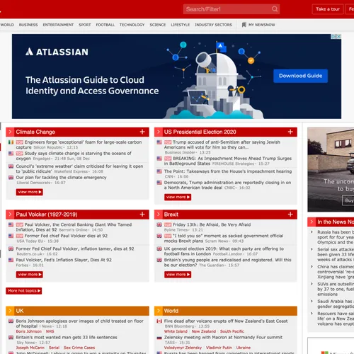
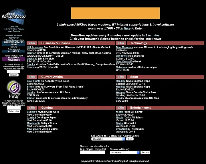
Over 20+ years of constant iteration, NewsNow had accumulated technical debt and design decisions that made sense in 1997 but not in 2019. The existing design wasn't flexible enough to accommodate planned improvements to functionality. We needed both a fresh coat of paint and a rethink of the foundations underneath.
Goals
The new design needed to:
- Give the product an aesthetic lift, bringing it in line with contemporary standards
- Adhere to WCAG AA accessibility standards where possible
- Be modular, flexible, and scalable to accommodate complex future features
- Retain high browser compatibility for diverse users in developing countries
- Work on feature phones using Opera Mini with extreme data saving enabled
- Most critically: improve the experience without alienating millions of loyal, long-standing users
Method
Initial Reskin and Research Foundation
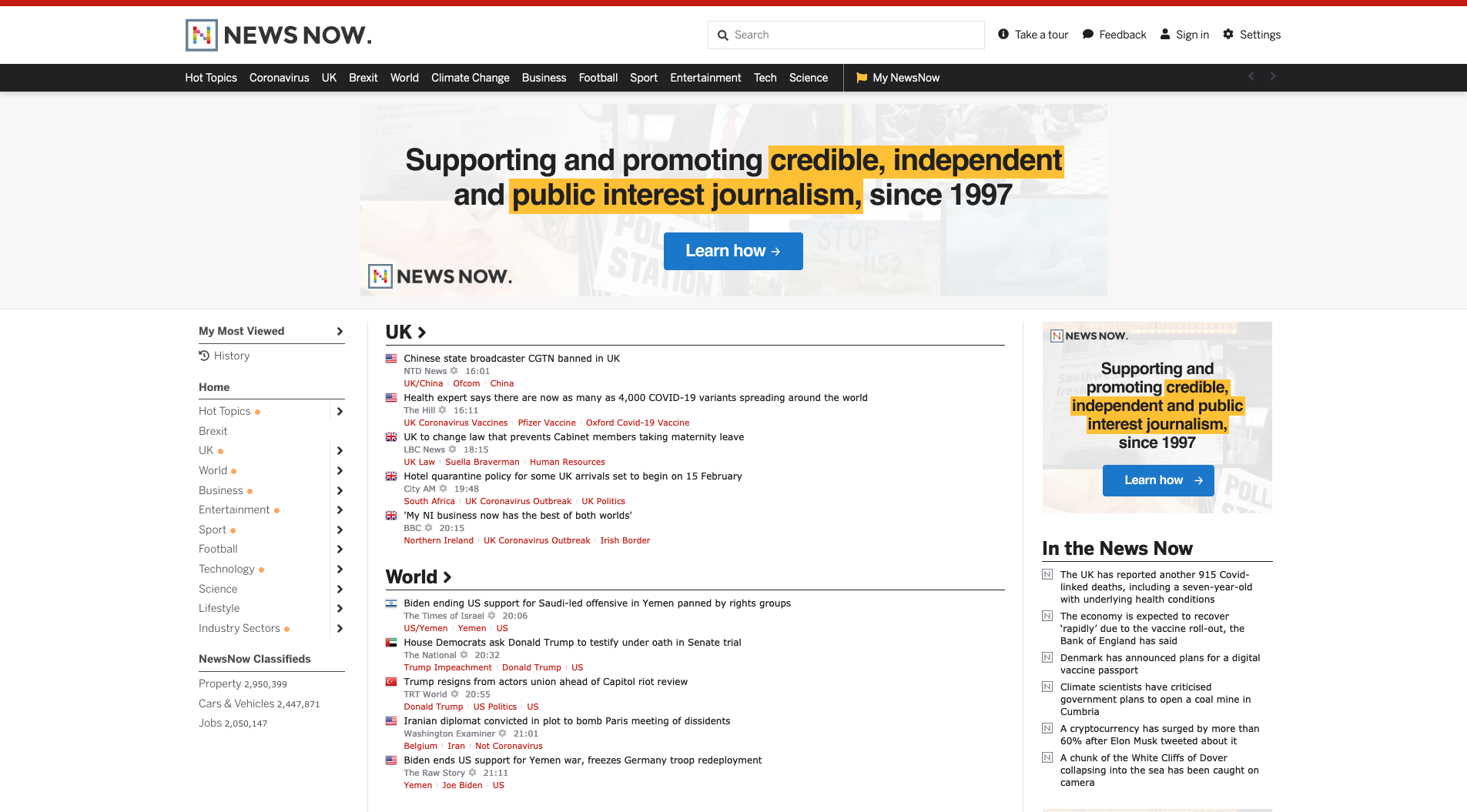
I started with a straight-to-code reskin of the existing design using NewsNow's in-house containerised development platform. This gave us a stable foundation whilst I conducted the company's first user research initiative in 25 years.
The research was more revealing than expected. Over 6000+ survey responses across the UK, US, and Nigeria, plus moderated interviews, uncovered three distinct regional use cases:
- UK users: Predominantly older, obsessed with football, wanted dense headline lists for granular coverage
- US users: Mixed demographics, broader interests across politics, business, and entertainment
- Nigerian users: Younger, mobile-only on feature phones via Opera Mini, following Premier League football and Nigerian politics
Competitor Analysis: Learning from Reddit's Mistakes
NewsNow shared parallels with Reddit: long feeds of headlines across endless topics, algorithmically sorted, with a dedicated userbase attached to specific workflows. Reddit had recently undergone a major redesign that generated massive backlash, so I conducted a thorough analysis of their process, outcomes, and user reactions.
The key lesson was that users weren't resistant to change - they were terrified of losing functionality.
Reddit had attempted to solve this problem by offering a 'compact' mode, but even old reddit was far less dense than our headlines. I decided that instead of choosing between modern and classic designs, we should just have both - plus a third option.
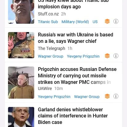
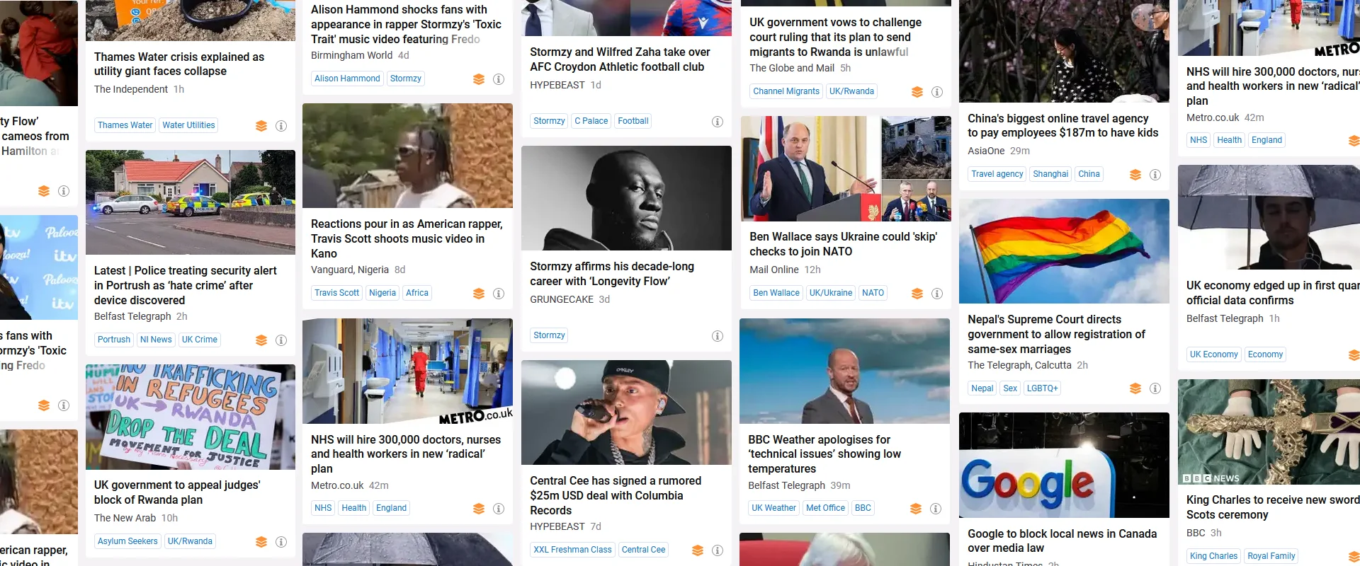
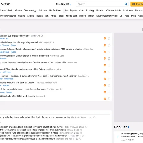
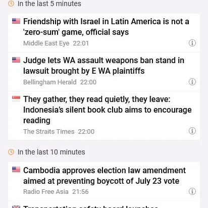
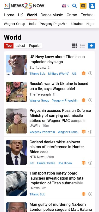
Three layout modes:
- Card View: Modern, image-heavy for newcomers comfortable with social media patterns
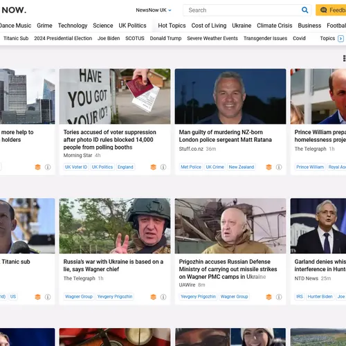
- Classic View: Original list density for power users with established workflows
- Compact View: Ultra-high density for users who wanted to scan maximum headlines quickly
This was NewsNow's first time hosting images after decades of text-only headlines. The research showed most users would embrace this - as long as we preserved access to their preferred workflows.
Design System: Atomic Principles
I employed atomic design principles to create a modular, component-based system in Figma with standardised tokens for measurements, colours, and typography. Components used BEM-style naming conventions for all UI elements, templates, and pages. The design was carefully tested against WCAG accessibility guidelines to ensure sufficient colour contrast ratios, font sizes, and interactive element distinction.
Working closely with the senior front-end developer on the front-end infrastructure, we collaborated on stacks, tooling, and coding practices that spanned design and development, so we had parity in the way that our respective components were structured, named, and implemented.
Technical Implementation: Vue.js on Legacy Infrastructure
We rebuilt the entire front-end in server-side rendered Vue.js with VueX state management whilst maintaining the existing Perl backend. The technical constraints were significant:
- Maintain SEO performance for millions of indexed pages
- Ensure compatibility with Opera Mini on feature phones (for Nigerian users on limited data)
- Create a component system that developers would actually want to use
- Support browsers and devices from a decade ago
The solution: Progressive enhancement with CSS feature queries to serve appropriate experiences without breaking anything. I devised a new device-detection system using media queries and support queries in CSS, replacing the complex JavaScript-heavy matrix that previously required individual support for each device type. This was important because we needed to support Opera Mini running on Nigerian feature phones, so support queries gave us a much more efficient way to do that.
Brand Development
Since NewsNow had never devoted time to formal brand identity, I worked with senior management through multiple brainstorming sessions to develop preliminary brand guidelines. This included defining brand values, identity, and ethos, plus visual elements like typographic rules, a new colour palette, and logo guidelines. The visual aspects were intended to evolve throughout the design process, but defining core brand values was instrumental in subsequent design decisions.
Rollout Strategy
Learning from Reddit's mistakes, I developed a transparent rollout approach:
- Published a Medium post explaining the changes and reasoning
- Implemented in-app feedback mechanisms with Hotjar, with responses guaranteed from myself and the Editor in Chief
- Staggered rollout ensuring feature parity before site-wide launch
- Maintained the old design as a fallback option (old.reddit.com style)
The feedback inbox was shared between myself and editorial, since much of what we received concerned content rather than design. This collaborative approach helped us respond quickly and appropriately to user concerns.
Results
The redesign succeeded by every measure we could track. User satisfaction metrics improved steadily throughout rollout via our in-app feedback mechanisms. We received positive feedback from both new users (who found it more approachable) and power users (who retained access to their preferred workflows).
The design system enabled rapid iteration on new features. The Vue.js architecture made development faster and more predictable. The research programme became an ongoing capability informing all subsequent product decisions.
Looking back: I'd have conducted user research even earlier to challenge more legacy assumptions from the start. But given the constraints - redesigning a 24-year-old platform serving millions whilst maintaining backwards compatibility with feature phones - this was the largest, most complex, and highest quality piece of work I'd delivered at that point in my career.