NewsNow
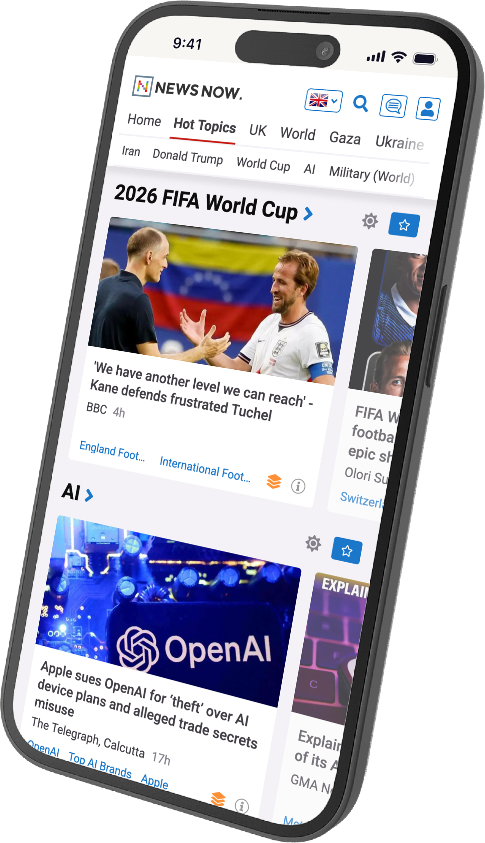
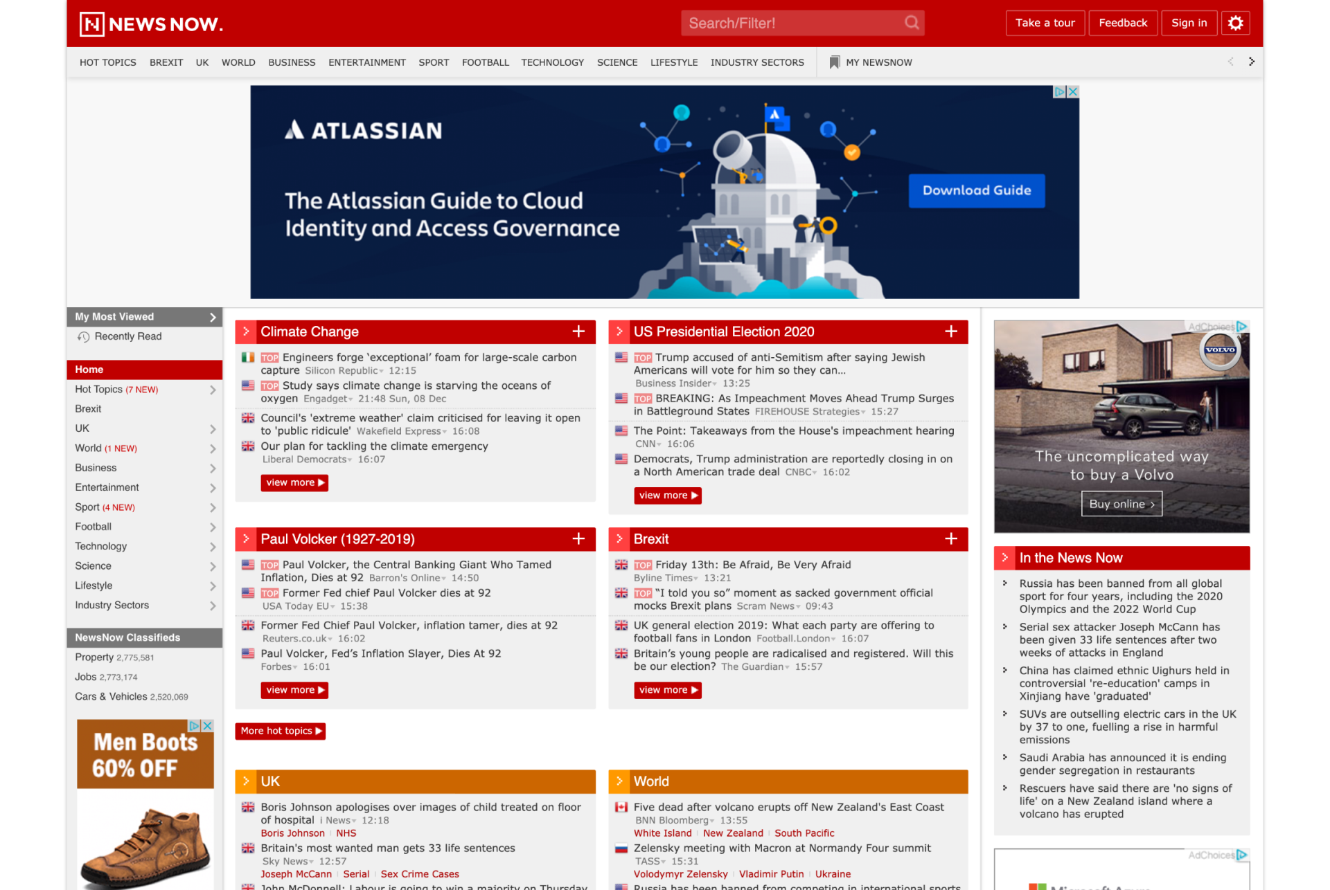
NewsNow is a news aggregator that has been running since 1997, with tens of millions of monthly uniques and a front end that hadn't been meaningfully touched since 2007. I joined an engineering-led company as its sole designer, front-end developer, researcher and product strategist, reporting to the CEO and COO. The brief was to make it contemporary without breaking the workflows that millions of users relied on daily.
Understanding the product before redrawing it
Before I could design anything sensibly, I had to get deep into the structure of the product: a legacy Perl codebase and a custom CMS built by the principal engineer. I rebuilt the front end in server-side-rendered Vue.js around a proper design system, and worked with the engineering team to rework the architecture so the front end and the CMS shared the same component structure, top to bottom: atomic components, standardised tokens, BEM naming, tested against WCAG AA.
A lot of that was shaped by who we were building for. Many users were in Nigeria, on feature phones, reaching the site through Opera Mini with extreme data saving enabled. That setting has real consequences for how you build: it ignores font-size style rules, and every request counts, so the icons all had to sit on a single sprite sheet. I replaced a JavaScript-heavy device-detection matrix with media and support queries in CSS, and used progressive enhancement so the experience held from a current phone down to Opera Mini without breaking anything.
One global product was really three
Research ran alongside from the beginning: the company’s first programme in twenty-five years. A site-wide survey gathered over six thousand responses across the UK, US and Nigeria, weighted by geography and device and checked against public data from Ofcom, Pew, Statista and SimilarWeb. Moderated interviews followed, run not on static mockups but on a working Vue.js staging build with real data, which caught complexity a prototype would have missed.
It showed the one global product was really three regional ones. UK users skewed older and were obsessed with football, wanting dense headline lists for granular coverage. US users were more mixed, with broader interests across politics, business and entertainment. Nigerian users were younger and mobile-only, following Premier League football, which they got better through our aggregation than from local sites, alongside Nigerian politics. The other clear finding was that users weren’t resistant to change so much as afraid of losing the functionality they relied on.
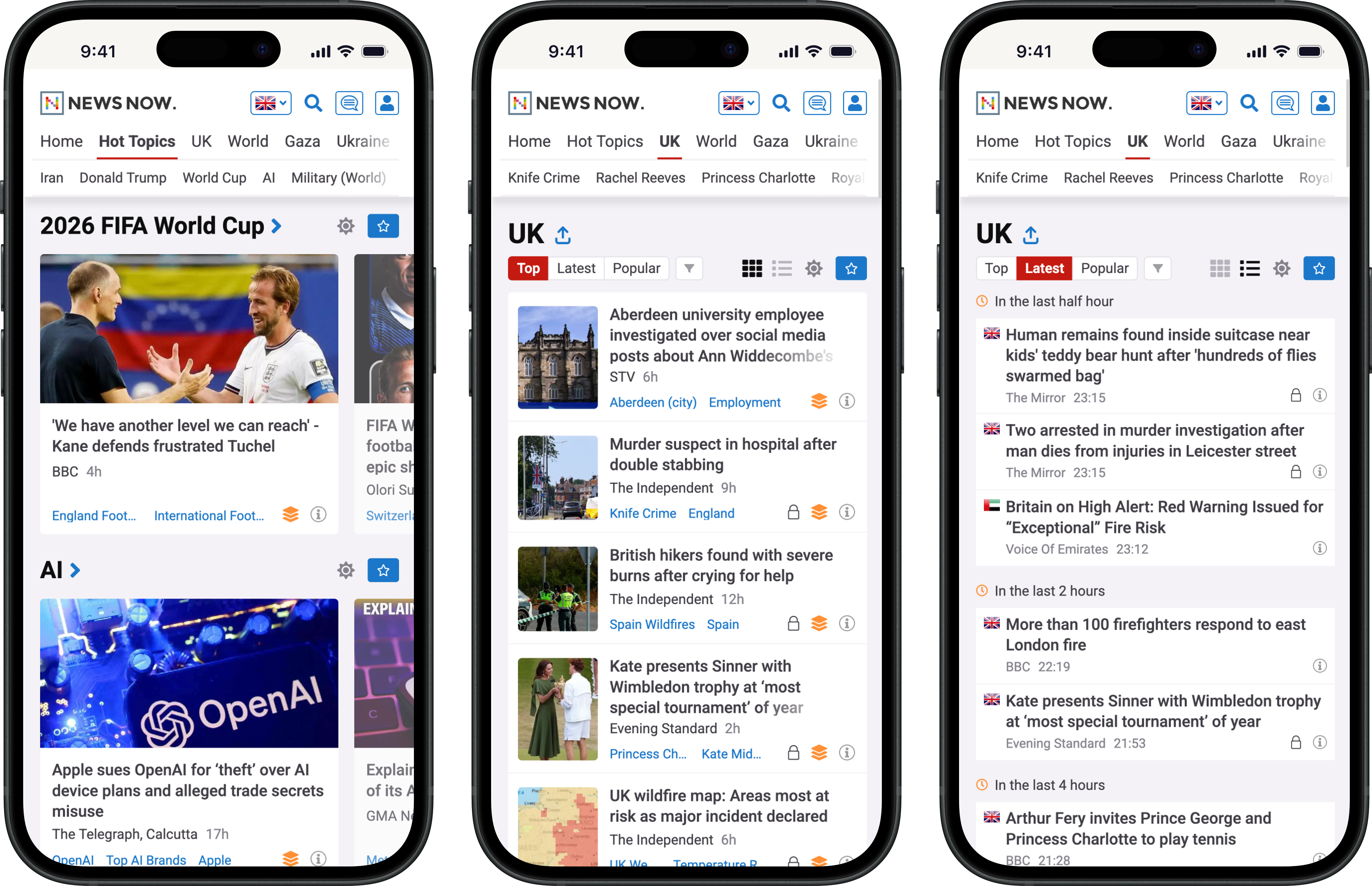
So rather than pick between a modern layout and the classic dense one, I built three: a card view, image-heavy, for newcomers used to social feeds; a classic view at the original density for power users with established workflows; and a compact view for scanning the maximum number of headlines at speed. Reddit had tried something similar shortly before and triggered a user revolt, so I ran a deep case study of what went wrong and used it to shape a staged rollout: announced openly in a post explaining the reasoning, released only at feature parity, with the old design kept as a fallback. It brought millions of loyal users across without one.
Off the screen, too
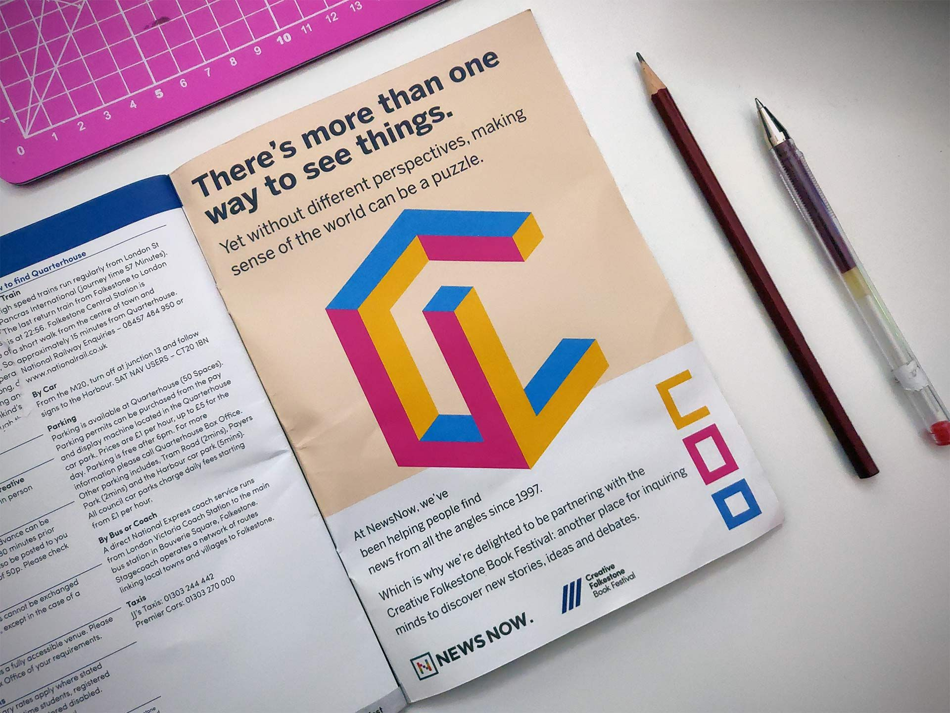
NewsNow was principal partner of the 2019 Folkestone Book Festival, which came with the projector in the main theatre, kiosks in the foyer and a free hand on merchandise. I built the kiosks as a Vue.js app pulling live news feeds straight from NewsNow’s API, running on Raspberry Pis with fallbacks for poor connectivity. I also made the promotional video for the auditorium and the kiosks: essentially an ad, put together on a tight deadline as a collage of editorial news footage and stock, which I edited and partly scored. For the festival programme I designed a 3D isometric shape that reads as a different 2D shape from each axis, a literal take on the idea that there’s more than one way to see things.
What it established
By the end, NewsNow had its first proper mobile design in twenty-four years, three layout modes that suited three different audiences, a design system the team could build on, and the company’s first user research programme. Through the project the company moved from engineering-led assumptions towards evidence, with design starting to inform what got built rather than only how it looked.